Monday, December 17, 2012

Another Artist Impression

Creating artist impressions is an enjoyable outlet for a few of the things that really interest me.

Firstly it’s drawing, but with a focus on architectural subjects. Drawing houses and buildings is probably about as close to actual property development as I’ll ever get. Although as a keen Do-it-yourself-er, I’ve tried building all sorts of things around my place from pergolas, garden sheds and sleepouts to landscaping stuff like retaining walls, decks and fences.

I don’t think I’ve built any of those things without drawing them first to make sure I like what I’m doing and to work out how much it’ll cost.

Secondly, I love working on landscaping projects, the whole gardening thing and the myriad of possibilities there are for beautifying a property with plants, shrubs and trees is just the icing on the cake. If you’ve read anything on my Garden Blog then you’ll know how much I enjoy that kind of thing.

So, although I’ve never actually studied architecture or horticulture and I’m not actually a builder, that hasn’t diminished my interest in those things. And the good thing about drawing them is I can dream big and it doesn’t cost me anything except a bit of time and imagination. So, what better way to put all those interests together than drawing artist’s impressions.

So this is what I do. The first thing I need is a set of architects drawings, a couple of elevations like so...


From those I create a 3D model and then add colour and detail to all the visible surfaces...


Then, using the architects site plan and a photo of the property as references...


I position the 3d model making sure the model is rotated to the correct viewing angle and scaled to the correct size. Then with a few landscaping features added like stone walls and garden planting, as well as 1 or 2  adjustments to colours and other minor details, the job was practically done.


It’s a worthwhile investment for any property developer to make, especially if financing the project is an issue. An artist’s impression like this can be used to arrange funding especially for spec building, where a buyer needs to be lined up first before the commitment is made to start building.

Thursday, October 25, 2012

SOLD! Kia Ora Cap


I can sense a theme developing here... 

not that I want to be ‘pigeon-holed’ as if this is all I can do (ie. cashing in on people’s familiarity with known brands and adapting them to a particular audience), but a sale’s a sale and this kind of thing seems to be what people are buying lately.

so why not?

“Kia Ora” 

means “Hello” and is a common greeting amongst the New Zealand Maori people. 
Yet interestingly the first sale of this cap was made to somebody in Japan.

A common complaint heard in NZ is that its residents leave its shores in droves in favour of living elsewhere in the world. I reckon a few of them must be missing home.

If you want one of these caps, visit my Zazzle site here... Kia Ora cap


Wednesday, October 17, 2012

Artist’s Impression

From time to time I get asked to produce artist’s impressions, usually involving architecture of some kind which is designed to be used for promotional purposes.

This time it was a builder who approached me with a photo of a Sleepout he built. (A sleepout is a cabin about 3 metres square, designed for sleeping, but can also be used as a utility room like an office or painting studio, etc).


Auckland is facing a housing shortage at the moment so he came up with the bright idea of catering to a particular niche by building low cost sleepouts for anyone who has a bit of space in their back yard. He wanted to put together a little brochure, and he obviously recognised the importance of presentation so hence the need for an artist’s impression of how this would look in somebody’s garden.

The sleepout he'd built had a single door and separate window in the front, but he wanted to show one with a ranch slider in a nice garden setting, making it look more “homely”.


So this is what I came up with for him...


He was more than happy with it — and so was I. 

Hopefully he’ll now get plenty of orders for his Sleepouts. 
Click the following link to see another example of an artist’s impression I’ve done.

Tuesday, August 21, 2012

Logo Development

Recently I was asked to design a logo for a new start up business that was engaged in supplying second hand tools to tradespeople and DIYers. It is a mobile service and the name they came up with was “Tools 2 Go”.

It’s interesting that even small one-man-bands these days are recognising the importance of branding their businesses. So I thought I would live dangerously and attempt to explain to process I went through in coming up with their logo.

It all starts with the brief from the client.

In this case he had a few fixed ideas about what he wanted:
• Firstly the name he’d chosen ‘TOOLS 2 GO’ needed to feature the figure 2 (not the word ‘to’)
• Secondly the colour scheme was to be yellow and black. The reason for this was his love for the well known DEWALT logo, a brand leader in the tools game.

Incidentally, yellow is also a colour often associated with low cost, no frills, types of businesses. You only have to think about ‘Smart Buy’ and ‘Pak n Save’ to know what I mean. This potential perception would probably not hurt his business especially in the current economic climate.


As far as fonts go the DEWALT logo uses a very simple, manly font with no frills which I’m sure is part of its appeal.

So, the first thing I did was get started with some different fonts and concepts to see what might work...


I often like to explore the possibility of using some kind of graphic in my logos but in this case my initial efforts were looking either too detailed or they were overpowering the name too much. In the image above you can see I was exploring how much ‘graphic’ input the logo should contain. In order to achieve a simple, manly result it would need to be a case of “less is more”. I needed to keep this thing really simple.

Also the right balance of colours would be important (ie. yellow and black). This would become more important if it ever needed to be reversed onto a black background. It would need to work equally well both ways. I also liked the idea of giving it a focal point by using a splash of one additional colour: RED.

As for the font. I liked the chunky, chiselled “Machine” font which had a tough manly feel about it. So there were some aspects of the initial concepts that I liked but others would definitely have to go. This is what I came up with...


The client liked the idea of a toolbox graphic, although initially he thought it was a suitcase. For me the idea of a toolbox lent itself well to being simplified down to a very simple, basic shape (more so than the delivery van idea) and yet it was still recognisable and emphasised well the mobile aspect of his business, especially with the word GO right there on that part of the logo.

The client was very pleased. So was I, so I used it in an advertisement for my logo design service which I placed recently on the classifiedpages website. Check it out here: logo designer north shore.

I also created a reversed version with his tag line added to be used as his website header.


Wednesday, July 18, 2012

Bull Dog design

There’s nothing like making a sale for boosting one’s confidence.

So before the excitement wore off I started trying to think of a new design theme for some more souvenir/apparel items...


I really love the whole combination of typography, illustration and general branding techniques. I know it’s probably not everybody’s cup of tea but it’s something I can’t help myself doing — probably all those years spent designing corporate logos and brands.

Bull Dogs are really cute in their own special way, so for anyone who owns one I created a few different products that honor these ‘beautifully ugly’ creatures.

See some of the products I created here.
Long Sleeve Tshirts
Long Sleeve Dark Tshirts

Monday, July 16, 2012

The ‘Calculated’ Approach seems to be working!


I wouldn’t normally talk about the same design twice unless there was a good reason.

In this case it seems the ‘calculated’ approach I took with this design is paying off. I mentioned in a previous post how I intentionally merged 2 popular ideas: 1. the love for a cute animal with  2. the brand awareness of a certain 'Tennessee Whiskey'.

Well, it’s appealed to somebody else now — this is sale number 2, which came from a completely different continent this time. It was obviously a woman — who customised it onto this long sleeved red t-shirt. It actually looks really good.

I hope she likes it.

I’ll have to start thinking of some new designs using this same approach.


Tuesday, June 5, 2012

Kakapo Merchandising


Conservation is on a lot of people’s minds these days and extraordinary efforts are being made to save a whole host of endangered species throughout the earth. Understandably, the people involved in trying to save them have become very passionate about the task at hand. I met somebody recently who’s involved in trying to save the NZ Kakapo.

The Kakapo is one such example on the endangered species list with only about 40 adult birds surviving in the wilds of New Zealand. Known as the “owl parrot” due to it’s nocturnal habits, it’s virtually flightless. Being extremely fat probably doesn’t help — some adult birds can weigh up to 3kg.


As a bird lover myself I find them really cute, not that I’ve seen one up close — such an experience would be a real privilege. So what better subject for a new range of merchandising items than the NZ KAKAPO. Hopefully there will be others out there who feel the same way as I do and are moved to get their hands on one of these items.

See more Kakapo items on my Zazzle site here: NZ Kakapo souvenirs

Purchase Cap: NZ Kakapo Cap
Purchase Tote Bag: NZ Kakapo Tote Bag

Monday, May 28, 2012

SOLD! “Jack Russell” Dog Vest


It’s nice to know somebody appreciates my work. Although I must admit, this was a rather calculated attempt at making a sale.

For a start it’s amazing how much people love their animals and it seems people are willing to spend as much money on their pets as they do on themselves. Aside from this, writing the words Jack Russell in the same font and format as the “Jack Daniels’ — Tenessee Whiskey” logo may have given the design a cool hint of familiarity for anyone that way inclined.

Anyway, a sale’s a sale even if I did only make a couple of dollars on it.


Pity I couldn’t get a Jack Russell to model it for me. But he is cute!

Check it out on the Zazzle site here

Tuesday, May 8, 2012

Playing with Patterns


It’s amazing what you can learn on the internet these days. 

Using a couple of New Zealand souvenir designs I created a couple of months ago I created these repeating patterns for an iPad cover. Thanks to a very helpful vector tutorial by Vectips it was actually pretty simple.

Now that I’ve figured out how to make a seamless pattern, there’s all sorts of applications this could be used for... I might even make the odd necktie! Watch this space...

I’ve posted this item for sale on Zazzle here and here

Monday, May 7, 2012

Obsessed with T-Shirts


I don’t know why I’ve been so obsessed with T-shirts lately. 

I think it has something to do with when I was a young teenager in the late 70’s. A friend of the family who had been to the US had brought back some souvenir t-shirts as gifts. They were so different from anything you could buy in NZ at the time. I loved them. They were a real pleasure to wear and the designs were quite inspiring for me as a young ‘wanna-be’ artist at the time.

Perhaps it’s the 30+ years of pent up desire to create a few of my own t-shirt designs that’s finally coming to the surface. Up until about a year ago there was no way I could manage the whole t-shirt printing process myself, from design to end consumer without forking out heaps of money — that is, until I stumbled across “Zazzle”. 

If you haven’t heard of Zazzle, you’ll no doubt hear me talk more about it on this blog, as it’s opened up a whole new way for me to showcase some of my work. At the same time it has made some of my designs available for sale to anyone who’s interested in buying a T-shirt, or any other product for that matter, including caps, mugs, aprons, tote bags, etc.

So, here are a few designs I’ve been working on...


This is how they looked on T-shirts...


Zazzle allows you to customise the various designs and products that are available. Choose your own t-shirt colours and styles, add your own text or put the design onto other products. Check it out here.

Monday, April 30, 2012

The ‘Four Square’ Store

I started acrylic painting several years ago and have been enjoying it whenever I can get to it. Unfortunately I don’t have as much time to spend on it as I would like.

Here’s a painting I did last year from an old photo. 

This was a deeply personal painting for me as the photo was taken by a relative a few years before I was born. These shops are less that a block from the house where I grew up and only about 5 kilometres from where I currently live. All but 2 of the people in the scene are family members including my grandfather who has long since passed away and my parents who were courting at the time. I love the old cars (the model T ford and the 'Morri thou' van) which give the scene a real historic flavour. The Model T ford belonged to one of my uncles who like me also enjoys painting. The van belonged to the shop owner, who is also one of my uncles.

I tend to approach my paintings as a typical 'graphic designer' would, that is, in a very controlled and predictable way. I usually work from a photo or other carefully planned reference even if it’s a sketch or an illustration I’ve already drawn. I usually have a very clear idea of what I’m trying to do before I even start.


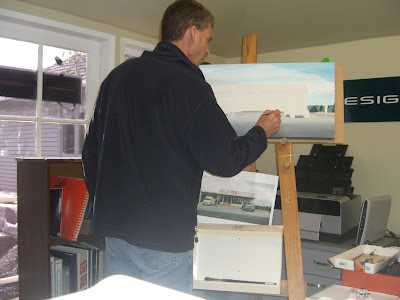
What I did to start was to enlarge the original photo on a photocopier to the final size I needed it. Then I rubbed the back of it with a 4B pencil following the edges of all the main elements, producing a stencil. Then I transferred the image by drawing over the top of the stencil with a ball point pen using enough pressure to transfer the pencil rubbing to the canvas, all the while making sure the stencil didn’t move. If you look carefully, you can see the finished pencil outline on the canvas (above).


Then it was time to start painting. I started with all the broad areas of colour first. In this case the road in the foreground and then the sky area. Then working colour by colour, area by area, I gradually covered the canvas with paint.


I’ve had the painting hanging in my front room for a while now, even though I’m not totally satisfied it’s finished. It’s been a great talking point as many visitors to the house have commented on it. Most of them frequent the location where this scene is, which is now a thriving multi-level shopping complex, complete with McDonalds and other big brand mega stores. Most of them have no idea it’s the same place.


What about you? Can you guess where it is? 
It’s somewhere on Auckland’s north shore around 1958. 
If you look carefully you can see Rangitoto island (a dormant volcano) in the background.

This how it looks today, more than 50 years later...

Monday, March 26, 2012

The New Creative Blog

I've been meaning to start a "Creative" blog for some time but have been procrastinating as usual.

I've been working and playing in the creative world for practically my whole life. I decided at age 8 that I wanted to be an artist when I grew up – not that I had much in the way of any 'natural' talent – I just loved being creative... with pens, pencils, crayons, felt tips, paint... you name it.

Amazingly, I've been working – and surviving, as a freelance Graphic Designer in Auckland since 1986. Before this I served an apprenticeship as a sheet-fed printer starting in 1980, after all my efforts at getting into a "Graphic Artist" position had failed. I started off learning letterpress printing techniques which introduced me to different ways of being creative. It was more mechanical than anything else I'd done before – it was great, I loved it!

I soon learned the value of turning my art into something commercially viable. It's something I'm still working on today — 3 decades later.

My reasons for creating this blog are firstly as an outlet for showing off some of the things I've done in the past and am doing currently. But I've also been told that blogging can be good for business and that if anything's being created for commercial reasons, people eventually need to know about it.

So, I hope that what I have to show and tell will be of interest and I welcome any feedback. I'll be creating links to examples of work I've done that are already on the internet and to sites where, if you like what I've done enough, you might even like to purchase something.

Please feel free to comment.

Thanks for visiting my blog!