I’ve been taking photos for as long as I can remember. My brother and I were each given a blue plastic Hanimex camera when we were about 7 or 8 years old, back in the early 70’s. I seem to recall mine eventually melted in the sun one day when I left it in my dad's car on a hot summers day. My brother never used his, so at least I was given a second chance.
I was never really shown how to take a proper photo but have always had an interest in it. But it’s only in recent times, since I got myself a digital SLR camera that I decided to get serious about taking good photos.
Having spent most of my life following various other creative pursuits, the ‘art’ of taking a good photo feels a lot more intuitive than it was when I was young. But having said that, there are still a lot of technical things I still need to understand, but I’m getting there.
It took me the first 1200 shots on my new Nikon D7000 to figure out how to do this...
Essentially it’s the result of a whole variety of different factors, some technical, some artistic. One thing I’ve discovered is that something as seemingly simple as ‘patience’ can make the difference between a shot that is either mediocre or outstanding. Especially when you’re relying on certain elements that are outside your control, like the weather and capturing a scene in the best light.
I’ve decided to show off some of my photos on Flickr under my new D-Mac NZ brand.
See more shots on my Flickr page here.
Tuesday, July 23, 2013
Wednesday, March 27, 2013
Reviving Black & White
I have produced hundreds of pieces of artwork over the years, some of which has never seen the light of day or it’s potential was never fully realised at the time. So I decided to try recycling some of it and give it a new twist.
I did a lot of designs using black and white back in the late 80’s and then again in the late 90’s. I’ve noticed how Black and white as a fashion statement comes and goes, so perhaps these cushion and pillow designs will appeal to those who love the NZ outdoors and want to go with a black and white theme. They feature some of the Flora and fauna that makes New Zealand so special.
I thought while I was about it a messenger bag might look pretty cool with the same design on it, but in this case with a subtle accent of colour.
There’s something about the use of fabrics that really appeals to me. It’s an avenue I haven’t explored fully. Perhaps I should do so.
If you want any of these items you can purchase them by following these links:
Wednesday, January 23, 2013
Handyman Signage
As far as advertising goes, Vehicle Signage is a very cost effective way of getting your message out there. When Stu a north shore handyman called me I was happy to help him out. He had a few ideas of his own. He just needed help putting it all together.
Firstly he needed a logo. He had the idea of a kind of Super-Handy-man character. So I created this first, complete with his initials and the word HANDYMAN featured prominently on it.
Then he wanted to use a photo he’d taken of his wife and overlay it onto a large 'TO DO' list. This is because he’s found a lot of his best customers are women, who often have a whole list of things they need done.
So this was the initial concept I did for the side of his truck which included some additional graphics /striping to tie it all together. An important factor to keep in mind were the sliding door panels. The position of the graphics with these in mind was going to be quite important.
Stu also wanted to have some tools shown on the van somewhere. He’s got a tool for every job you can think of and he wanted this to be obvious. So I managed to find a really cool graphic in a stock photo library which I adapted by incorporating his initials and the Handyman wording...
Stu gets noticed everywhere. Often when he’s parked at the supermarket he’ll get people coming up to him asking him for a business card, so he’s got a bit of work off it already.
I got him to do a job round my place recently trimming trees. He did an excellent job.
If you’re on Auckland’s north shore and need a handyman, Call Stu. Tell him I sent you.
This is how his truck looked when it was finished.
Monday, December 17, 2012
Another Artist Impression
Creating artist impressions is an enjoyable outlet for a few of the things that really interest me.
Firstly it’s drawing, but with a focus on architectural subjects. Drawing houses and buildings is probably about as close to actual property development as I’ll ever get. Although as a keen Do-it-yourself-er, I’ve tried building all sorts of things around my place from pergolas, garden sheds and sleepouts to landscaping stuff like retaining walls, decks and fences.
I don’t think I’ve built any of those things without drawing them first to make sure I like what I’m doing and to work out how much it’ll cost.
Secondly, I love working on landscaping projects, the whole gardening thing and the myriad of possibilities there are for beautifying a property with plants, shrubs and trees is just the icing on the cake. If you’ve read anything on my Garden Blog then you’ll know how much I enjoy that kind of thing.
So, although I’ve never actually studied architecture or horticulture and I’m not actually a builder, that hasn’t diminished my interest in those things. And the good thing about drawing them is I can dream big and it doesn’t cost me anything except a bit of time and imagination. So, what better way to put all those interests together than drawing artist’s impressions.
So this is what I do. The first thing I need is a set of architects drawings, a couple of elevations like so...

From those I create a 3D model and then add colour and detail to all the visible surfaces...

Then, using the architects site plan and a photo of the property as references...

I position the 3d model making sure the model is rotated to the correct viewing angle and scaled to the correct size. Then with a few landscaping features added like stone walls and garden planting, as well as 1 or 2 adjustments to colours and other minor details, the job was practically done.
It’s a worthwhile investment for any property developer to make, especially if financing the project is an issue. An artist’s impression like this can be used to arrange funding especially for spec building, where a buyer needs to be lined up first before the commitment is made to start building.
Thursday, October 25, 2012
SOLD! Kia Ora Cap
I can sense a theme developing here...
not that I want to be ‘pigeon-holed’ as if this is all I can do (ie. cashing in on people’s familiarity with known brands and adapting them to a particular audience), but a sale’s a sale and this kind of thing seems to be what people are buying lately.
so why not?
“Kia Ora”
means “Hello” and is a common greeting amongst the New Zealand Maori people.
Yet interestingly the first sale of this cap was made to somebody in Japan.
A common complaint heard in NZ is that its residents leave its shores in droves in favour of living elsewhere in the world. I reckon a few of them must be missing home.
If you want one of these caps, visit my Zazzle site here... Kia Ora cap
Wednesday, October 17, 2012
Artist’s Impression
From time to time I get asked to produce artist’s impressions, usually involving architecture of some kind which is designed to be used for promotional purposes.
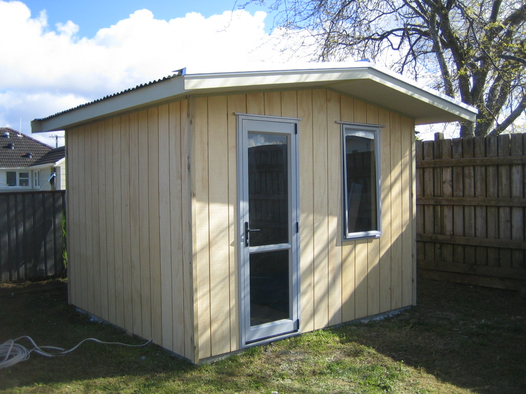
This time it was a builder who approached me with a photo of a Sleepout he built. (A sleepout is a cabin about 3 metres square, designed for sleeping, but can also be used as a utility room like an office or painting studio, etc).
Auckland is facing a housing shortage at the moment so he came up with the bright idea of catering to a particular niche by building low cost sleepouts for anyone who has a bit of space in their back yard. He wanted to put together a little brochure, and he obviously recognised the importance of presentation so hence the need for an artist’s impression of how this would look in somebody’s garden.
The sleepout he'd built had a single door and separate window in the front, but he wanted to show one with a ranch slider in a nice garden setting, making it look more “homely”.
This time it was a builder who approached me with a photo of a Sleepout he built. (A sleepout is a cabin about 3 metres square, designed for sleeping, but can also be used as a utility room like an office or painting studio, etc).
Auckland is facing a housing shortage at the moment so he came up with the bright idea of catering to a particular niche by building low cost sleepouts for anyone who has a bit of space in their back yard. He wanted to put together a little brochure, and he obviously recognised the importance of presentation so hence the need for an artist’s impression of how this would look in somebody’s garden.
The sleepout he'd built had a single door and separate window in the front, but he wanted to show one with a ranch slider in a nice garden setting, making it look more “homely”.
So this is what I came up with for him...
He was more than happy with it — and so was I.
Hopefully he’ll now get plenty of orders for his Sleepouts.
Click the following link to see another example of an artist’s impression I’ve done.
Tuesday, August 21, 2012
Logo Development
Recently I was asked to design a logo for a new start up business that was engaged in supplying second hand tools to tradespeople and DIYers. It is a mobile service and the name they came up with was “Tools 2 Go”.
It’s interesting that even small one-man-bands these days are recognising the importance of branding their businesses. So I thought I would live dangerously and attempt to explain to process I went through in coming up with their logo.
It all starts with the brief from the client.
In this case he had a few fixed ideas about what he wanted:
• Firstly the name he’d chosen ‘TOOLS 2 GO’ needed to feature the figure 2 (not the word ‘to’)
• Secondly the colour scheme was to be yellow and black. The reason for this was his love for the well known DEWALT logo, a brand leader in the tools game.
Incidentally, yellow is also a colour often associated with low cost, no frills, types of businesses. You only have to think about ‘Smart Buy’ and ‘Pak n Save’ to know what I mean. This potential perception would probably not hurt his business especially in the current economic climate.
As far as fonts go the DEWALT logo uses a very simple, manly font with no frills which I’m sure is part of its appeal.
So, the first thing I did was get started with some different fonts and concepts to see what might work...
I often like to explore the possibility of using some kind of graphic in my logos but in this case my initial efforts were looking either too detailed or they were overpowering the name too much. In the image above you can see I was exploring how much ‘graphic’ input the logo should contain. In order to achieve a simple, manly result it would need to be a case of “less is more”. I needed to keep this thing really simple.
Also the right balance of colours would be important (ie. yellow and black). This would become more important if it ever needed to be reversed onto a black background. It would need to work equally well both ways. I also liked the idea of giving it a focal point by using a splash of one additional colour: RED.
As for the font. I liked the chunky, chiselled “Machine” font which had a tough manly feel about it. So there were some aspects of the initial concepts that I liked but others would definitely have to go. This is what I came up with...
The client liked the idea of a toolbox graphic, although initially he thought it was a suitcase. For me the idea of a toolbox lent itself well to being simplified down to a very simple, basic shape (more so than the delivery van idea) and yet it was still recognisable and emphasised well the mobile aspect of his business, especially with the word GO right there on that part of the logo.
The client was very pleased. So was I, so I used it in an advertisement for my logo design service which I placed recently on the classifiedpages website. Check it out here: logo designer north shore.
I also created a reversed version with his tag line added to be used as his website header.
It’s interesting that even small one-man-bands these days are recognising the importance of branding their businesses. So I thought I would live dangerously and attempt to explain to process I went through in coming up with their logo.
It all starts with the brief from the client.
In this case he had a few fixed ideas about what he wanted:
• Firstly the name he’d chosen ‘TOOLS 2 GO’ needed to feature the figure 2 (not the word ‘to’)
• Secondly the colour scheme was to be yellow and black. The reason for this was his love for the well known DEWALT logo, a brand leader in the tools game.
Incidentally, yellow is also a colour often associated with low cost, no frills, types of businesses. You only have to think about ‘Smart Buy’ and ‘Pak n Save’ to know what I mean. This potential perception would probably not hurt his business especially in the current economic climate.
As far as fonts go the DEWALT logo uses a very simple, manly font with no frills which I’m sure is part of its appeal.
So, the first thing I did was get started with some different fonts and concepts to see what might work...
I often like to explore the possibility of using some kind of graphic in my logos but in this case my initial efforts were looking either too detailed or they were overpowering the name too much. In the image above you can see I was exploring how much ‘graphic’ input the logo should contain. In order to achieve a simple, manly result it would need to be a case of “less is more”. I needed to keep this thing really simple.
Also the right balance of colours would be important (ie. yellow and black). This would become more important if it ever needed to be reversed onto a black background. It would need to work equally well both ways. I also liked the idea of giving it a focal point by using a splash of one additional colour: RED.
As for the font. I liked the chunky, chiselled “Machine” font which had a tough manly feel about it. So there were some aspects of the initial concepts that I liked but others would definitely have to go. This is what I came up with...
The client liked the idea of a toolbox graphic, although initially he thought it was a suitcase. For me the idea of a toolbox lent itself well to being simplified down to a very simple, basic shape (more so than the delivery van idea) and yet it was still recognisable and emphasised well the mobile aspect of his business, especially with the word GO right there on that part of the logo.
The client was very pleased. So was I, so I used it in an advertisement for my logo design service which I placed recently on the classifiedpages website. Check it out here: logo designer north shore.
I also created a reversed version with his tag line added to be used as his website header.
Subscribe to:
Posts (Atom)